Wednesday 18 August 2010

Wednesday 11 August 2010

ambient display ideas


logo for the monitor could function as a quick glance dial to see current energy usage etc. Displayed as filling bar around edge. 

Wednesday 4 August 2010


development - appliances added to the main window float or sink depending on their energy use throughout the day. Objects could be animated subtly to suggest floating in water, sinking etc.  As the usage is constantly changing, objects will rise and sink.

comparison of energy use between appliances:


events picked out on power meter graph. Events that have not yet been defined have a generic icon (for example 'e') showing that they need user input. 

initial state could show events with very low opacity, then highlight when moused over. This could also bring up further information/detail on the event.


idea based upon the 'aquarium', filling a space idea. Dotted line represents target for the specified time period. 

more abstract idea:


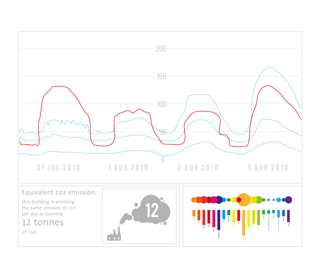
appliances are grouped and size of their bubble indicates the amount of energy they have used in a given time period (e.g. current day). A simple visual way of seeing how much energy has been used.


dotted rings around the circles indicate the maximum usage that has been set by the user in order to meet their daily/weekly/monthly targets. You can quite easily see which appliances have used more or less than expected and adjust settings accordingly, or alter your usage. 
different modes/axis for interface: